Banco Carrefour - New Digital Account and Pix
With the arrival of Pix as a mandatory infrastructure in the Brazilian financial system, the Digital Account experience was lagging behind the major fintechs and digital banks in the market. The lack of Pix, along with a navigation architecture that was not very intuitive, directly impacted the users' perception of the product's value.
In this context, I worked on the complete redesign of the Digital Account experience, covering everything from administrative features, such as statements, settings, and cancellation, to critical cash-in, cash-out, and transfer journeys via Pix.
The project also represented a strategic opportunity to expand the product. Originally designed for users who purchased the network's card machine (corporate profile), the new account also began to target individuals, increasing customer acquisition potential and competitiveness in the market.
Customer
Banco Carrefour
Banco Carrefour
Services
Discovery
UX/UI Design

Overview
Problem definition:
The Digital Account experience had several friction points. In addition to the lack of integration with Pix, the flows were considered slow, unintuitive, and excessively fragmented. Satisfaction indicators, such as NPS, pointed to growing dissatisfaction among corporate (PJ) users, especially with recurring tasks like transfers, checking statements, and managing receivables. At the same time, the product structure had not been designed to serve individual (PF) users, which limited client base expansion. The project's challenge was therefore twofold: to modernize the digital account experience to meet current usability expectations and, at the same time, to structure the product to support different user profiles with distinct financial needs.
Objectives:
Redesign the Digital Account experience, prioritizing clarity, operational efficiency, and navigational consistency.
Integrate Pix seamlessly and intuitively, allowing fast and secure transactions within the user's natural flow.
Expand the account scope to also serve individual users, keeping simplicity and accessibility as core principles.
Improve satisfaction and product value perception indicators, such as NPS and SUS.
Structure the experience in a scalable way, allowing for the future evolution of financial features.
Hands-on
With the problem well defined, I began the solution exploration phase by structuring the work into iterative cycles of understanding, definition, ideation, prototyping, and validation with users.
The goal was to ensure that each design decision was grounded in evidence from real use and aligned with both the sellers' needs and the company's strategic objectives.
Define:
Based on research insights and a comparative analysis with leading fintechs and digital banks, we identified experience patterns that could significantly elevate the quality of the Digital Account. Among the observed best practices were the use of customizable shortcuts, a simplified visual hierarchy, clear transaction feedback, and more direct, modular Pix journeys. These learnings helped establish the experience principles that guided the design of the new account.
Benchmarking
We conducted a comparative analysis of digital accounts from banks and fintechs that already offered mature Pix experiences. The goal was to understand how these platforms structured their transaction flows, organized information, and provided quick access to key financial features.
Feature Identification
The analysis allowed for the identification of features valued by users, such as quick shortcuts for transactions, a clear financial history, and simplified organization of limits and configurations. These learnings were used as a reference to structure the main flows of the new Digital Account.
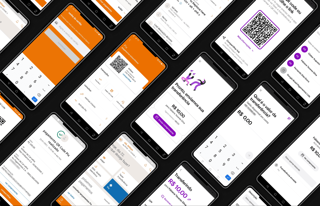
These definitions guided the strategic decisions when structuring the account's main flows.
Understand:
The initial phase was dedicated to understanding the real context of use of the Digital Account. I conducted qualitative interviews with active corporate (PJ) users and potential individual (customer) users, investigating financial behaviors, frustrations with the current product, and expectations regarding modern digital accounts. Additionally, we analyzed quantitative usage data to understand transaction frequency, most accessed features, and drop-off points in existing flows. The combination of these analyses revealed important patterns, such as a preference for visual shortcuts for frequent actions, a need for greater clarity regarding Pix limits and rules, and an expectation of interface customization according to the user's financial profile.

Target Audience
Market and user research analysis identified four main user profiles with distinct needs within the new Digital Account.
University Students (18-25 years old)
Characteristics:
Young people in search of financial independence and ease in managing their expenses.
Needs:
They need a fee-free account with fast transfers, simple payments, and features that help with expense control.
Young professionals (18-30 years old)
Characteristics:
Recent graduates or those starting their careers, familiar with technology and digital services.
Needs:
They value speed in task execution, integration with instant payment methods, and seamless experiences on mobile devices.
Liberal professionals and individual entrepreneurs (25-60 years old)
Features:
Self-employed professionals and small entrepreneurs who need to manage receipts and expenses in a practical way.
Needs:
For this profile, Pix becomes essential for instant payments and receipts from customers, especially in conjunction with the use of the card machine.
Retirees and People Close to Retirement (60 years or older)
Characteristics:
They seek a simpler management of their finances, with a focus on security and ease of use.
Needs:
They need an intuitive interface and accessible support, in addition to tools that help manage fixed income and bill payments.
Devise:
With the key insights consolidated, I conducted ideation sessions with the product and technology teams to explore different solution paths. We used wireflows, empathy maps, and prioritization exercises to structure experiences that would reduce cognitive effort in the most frequent tasks, such as transfers, statement queries, and Pix key management. The most promising ideas were refined into user flows and information hierarchies that prioritized clarity and operational efficiency.
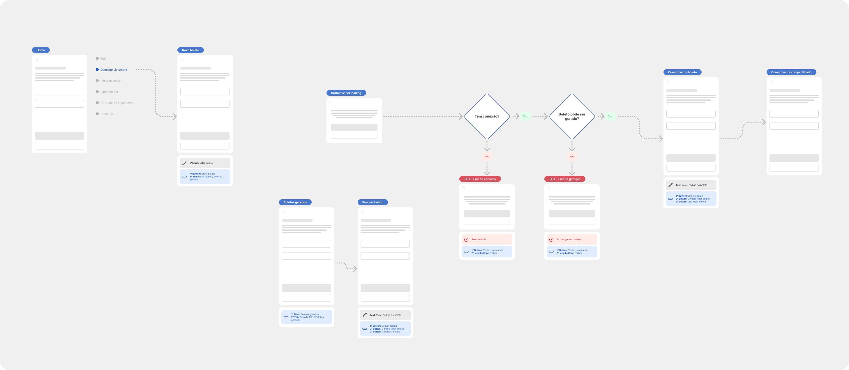
Accessibility
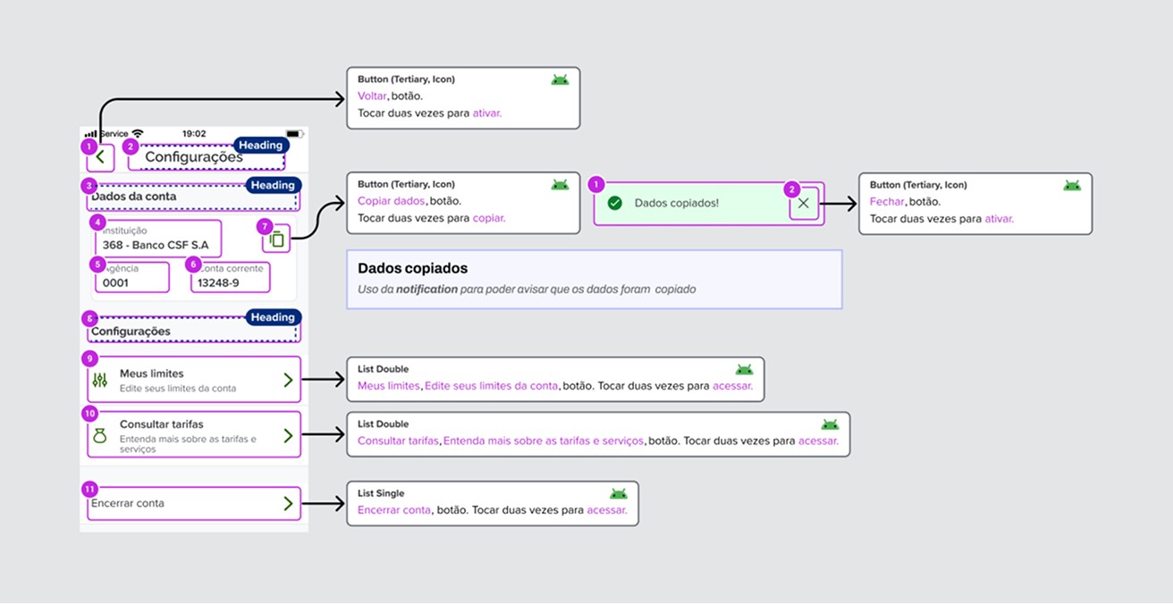
During handoff to development, I ensured that the interfaces followed accessibility best practices, including adequate contrast, typographical legibility, and consistent use of semantic components. This upfront focus contributed to a more inclusive experience and facilitated the technical implementation by the technology team.
Prototype:
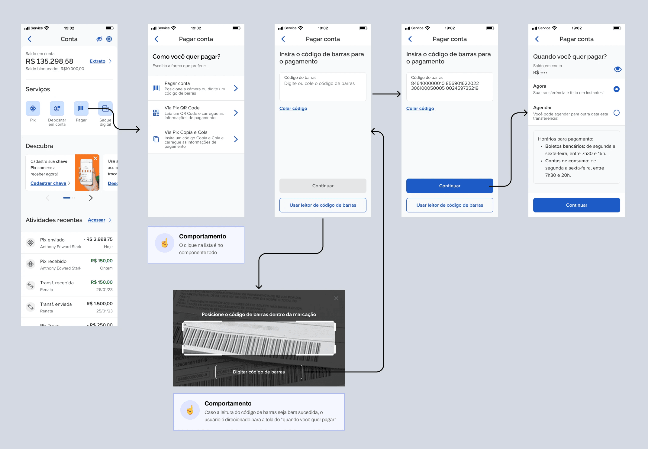
I developed interactive prototypes in Figma representing the main digital account user journeys, including Pix, transfers, statements, cash-in, cash-out, and account settings. The focus was to ensure clear navigation, consistency with the company's design system, and a smooth flow when performing the most frequent tasks. Protyping allowed us to validate the experience realistically before development, anticipating adjustments and reducing the risk of rework.
Test:
To validate the main design hypotheses, I conducted moderated testing with nine participants representing different user profiles. The sessions took place via Microsoft Teams using navigable prototypes and structured task scripts.
Pix
Register a new Pix key (email); immediate and scheduled Pix transfer; Pix transfer with branch and account
Deposit
TED Wire Transfer; Pix Copy and Paste; QR Code
Cash Out
TED Wire Transfer; Pix Copy and Paste; QR Code
Conducting the Tests
During testing, I encouraged participants to verbalize their thoughts in real time using the think-aloud method. This approach made it possible to identify friction points in navigation, better understand user expectations, and validate the clarity of the proposed interactions.
Examples of Positive Quotes
Participants expressed positive feedback during testing, orally validating the proposal. Here are some examples of quotes that were said:
Practical; Clear; Objective; Similar to market/banking apps; Simple; Familiar interface; Tasks without difficulty; Easy flow; Readable information; Accessible; Colors and font size; Easy-to-see shortcuts; App is not tiring (doesn't have too many steps); Smooth; Fast; Easy adaptation; Intuitive; Obvious; Super easy; Shortcuts; Easy language; Layout; Light mode; Meets needs; Agile processes; Lightweight; Practicality
Hands-on
With the problem well defined, I began the solution exploration phase by structuring the work into iterative cycles of understanding, definition, ideation, prototyping, and validation with users.
The goal was to ensure that each design decision was grounded in evidence from real use and aligned with both the sellers' needs and the company's strategic objectives.
Understand:
The initial phase was dedicated to understanding the real context of use of the Digital Account. I conducted qualitative interviews with active corporate (PJ) users and potential individual (customer) users, investigating financial behaviors, frustrations with the current product, and expectations regarding modern digital accounts. Additionally, we analyzed quantitative usage data to understand transaction frequency, most accessed features, and drop-off points in existing flows. The combination of these analyses revealed important patterns, such as a preference for visual shortcuts for frequent actions, a need for greater clarity regarding Pix limits and rules, and an expectation of interface customization according to the user's financial profile.
Target Audience
Market and user research analysis identified four main user profiles with distinct needs within the new Digital Account.
University Students (18-25 years old)
Characteristics:
Young people in search of financial independence and ease in managing their expenses.
Needs:
They need a fee-free account with fast transfers, simple payments, and features that help with expense control.
Young professionals (18-30 years old)
Characteristics:
Recent graduates or those starting their careers, familiar with technology and digital services.
Needs:
They value speed in task execution, integration with instant payment methods, and seamless experiences on mobile devices.
Liberal professionals and individual entrepreneurs (25-60 years old)
Features:
Self-employed professionals and small entrepreneurs who need to manage receipts and expenses in a practical way.
Needs:
For this profile, Pix becomes essential for instant payments and receipts from customers, especially in conjunction with the use of the card machine.
Retirees and People Close to Retirement (60 years or older)
Characteristics:
They seek a simpler management of their finances, with a focus on security and ease of use.
Needs:
They need an intuitive interface and accessible support, in addition to tools that help manage fixed income and bill payments.
Define:
Based on research insights and a comparative analysis with leading fintechs and digital banks, we identified experience patterns that could significantly elevate the quality of the Digital Account. Among the observed best practices were the use of customizable shortcuts, a simplified visual hierarchy, clear transaction feedback, and more direct, modular Pix journeys. These learnings helped establish the experience principles that guided the design of the new account.
Benchmarking
Study digital accounts from other banks and fintechs that have already incorporated Pix, evaluating how these solutions stand out in terms of usability, design, and features.
Feature Identification
Analyze which features are most valued by users in these competing products and how they can be adapted or improved in the new version.
These definitions guided the strategic decisions when structuring the account's main flows.
Devise:
With the key insights consolidated, I conducted ideation sessions with the product and technology teams to explore different solution paths. We used wireflows, empathy maps, and prioritization exercises to structure experiences that would reduce cognitive effort in the most frequent tasks, such as transfers, statement queries, and Pix key management. The most promising ideas were refined into user flows and information hierarchies that prioritized clarity and operational efficiency.
Prototype:
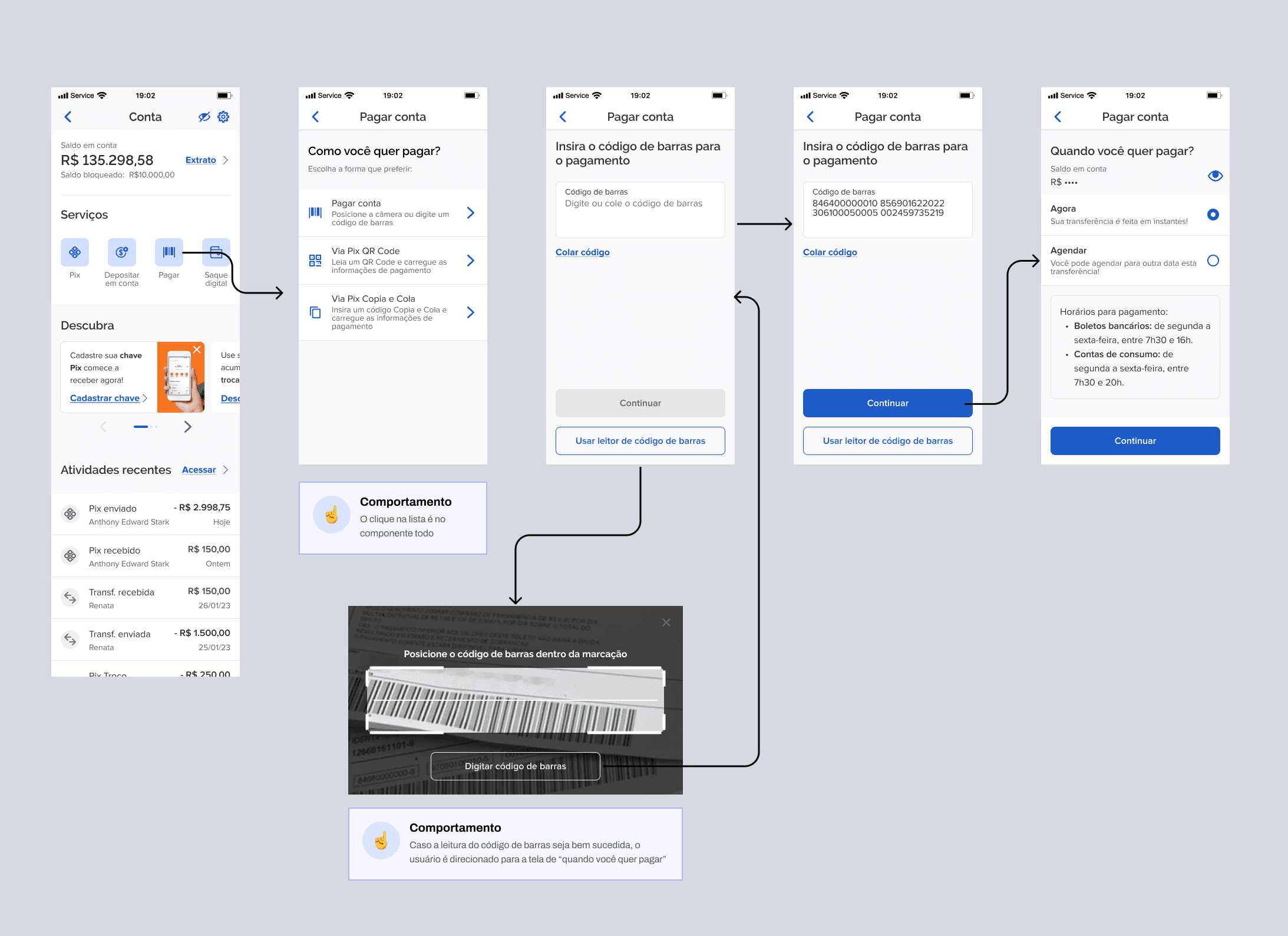
I developed interactive prototypes in Figma representing the main digital account user journeys, including Pix, transfers, statements, cash-in, cash-out, and account settings. The focus was to ensure clear navigation, consistency with the company's design system, and a smooth flow when performing the most frequent tasks. Protyping allowed us to validate the experience realistically before development, anticipating adjustments and reducing the risk of rework.
Accessibility
During handoffs, I ensured that all interfaces followed accessibility guidelines, focusing on contrast, readability, keyboard navigation, and semantic elements. This ensured a more inclusive experience from the very beginning of the project. The structured and documented delivery facilitated implementation by the development team, reducing communication friction and optimizing technical execution time.
Test:
To validate the main design hypotheses, I conducted moderated testing with nine participants representing different user profiles. The sessions took place via Microsoft Teams using navigable prototypes and structured task scripts.
Pix
Register a new Pix key (email); immediate and scheduled Pix transfer; Pix transfer with branch and account
Deposit
TED Wire Transfer; Pix Copy and Paste; QR Code
Cash Out
TED Wire Transfer; Pix Copy and Paste; QR Code
Conducting the Tests
During testing, I encouraged participants to think out loud, sharing their impressions while they performed the tasks. This approach not only helped identify friction points, but also captured valuable feedback on the interface's usability.
Examples of Positive Quotes
Participants expressed positive feedback during testing, orally validating the proposal. Here are some examples of quotes that were said:
Practical; Clear; Objective; Similar to market/banking apps; Simple; Familiar interface; Tasks without difficulty; Easy flow; Readable information; Accessible; Colors and font size; Easy-to-see shortcuts; App is not tiring (doesn't have too many steps); Smooth; Fast; Easy adaptation; Intuitive; Obvious; Super easy; Shortcuts; Easy language; Layout; Light mode; Meets needs; Agile processes; Lightweight; Practicality
Hands-on
With the problem well defined, I began the solution exploration phase by structuring the work into iterative cycles of understanding, definition, ideation, prototyping, and validation with users.
The goal was to ensure that each design decision was grounded in evidence from real use and aligned with both the sellers' needs and the company's strategic objectives.
Define:
Based on research insights and a comparative analysis with leading fintechs and digital banks, we identified experience patterns that could significantly elevate the quality of the Digital Account. Among the observed best practices were the use of customizable shortcuts, a simplified visual hierarchy, clear transaction feedback, and more direct, modular Pix journeys. These learnings helped establish the experience principles that guided the design of the new account.
Benchmarking
Study digital accounts from other banks and fintechs that have already incorporated Pix, evaluating how these solutions stand out in terms of usability, design, and features.
Feature Identification
Analyze which features are most valued by users in these competing products and how they can be adapted or improved in the new version.
These definitions guided the strategic decisions when structuring the account's main flows.
Devise:
With the key insights consolidated, I conducted ideation sessions with the product and technology teams to explore different solution paths. We used wireflows, empathy maps, and prioritization exercises to structure experiences that would reduce cognitive effort in the most frequent tasks, such as transfers, statement queries, and Pix key management. The most promising ideas were refined into user flows and information hierarchies that prioritized clarity and operational efficiency.
Accessibility
During handoffs, I ensured that all interfaces followed accessibility guidelines, focusing on contrast, readability, keyboard navigation, and semantic elements. This ensured a more inclusive experience from the very beginning of the project. The structured and documented delivery facilitated implementation by the development team, reducing communication friction and optimizing technical execution time.
Prototype:
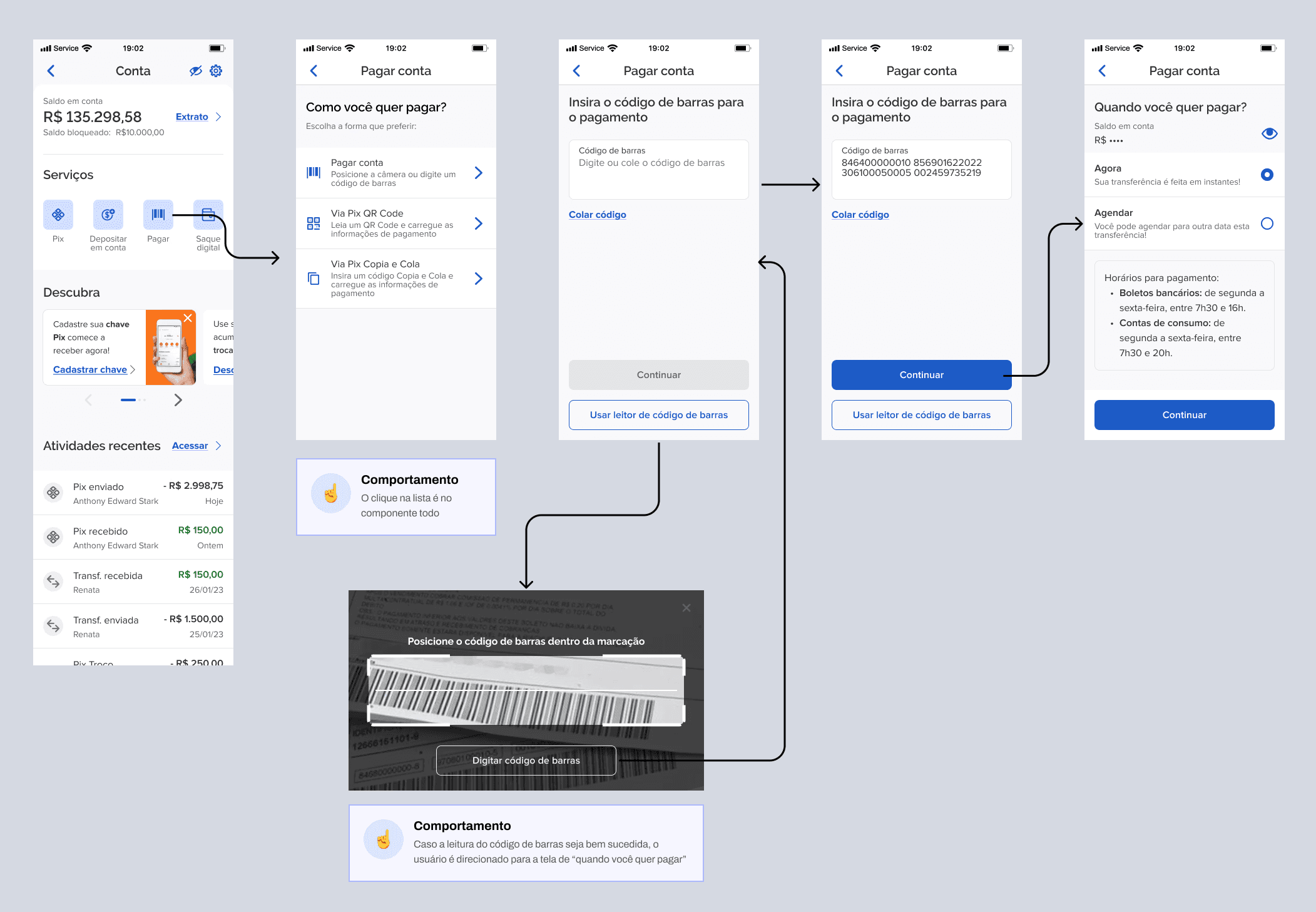
I developed interactive prototypes in Figma representing the main digital account user journeys, including Pix, transfers, statements, cash-in, cash-out, and account settings. The focus was to ensure clear navigation, consistency with the company's design system, and a smooth flow when performing the most frequent tasks. Protyping allowed us to validate the experience realistically before development, anticipating adjustments and reducing the risk of rework.
Test:
To validate the main design hypotheses, I conducted moderated testing with nine participants representing different user profiles. The sessions took place via Microsoft Teams using navigable prototypes and structured task scripts.
Pix
Register a new Pix key (email); immediate and scheduled Pix transfer; Pix transfer with branch and account
Deposit
TED Wire Transfer; Pix Copy and Paste; QR Code
Cash Out
TED Wire Transfer; Pix Copy and Paste; QR Code
Conducting the Tests
During testing, I encouraged participants to think out loud, sharing their impressions while they performed the tasks. This approach not only helped identify friction points, but also captured valuable feedback on the interface's usability.
Examples of Positive Quotes
Participants expressed positive feedback during testing, orally validating the proposal. Here are some examples of quotes that were said:
Practical; Clear; Objective; Similar to market/banking apps; Simple; Familiar interface; Tasks without difficulty; Easy flow; Readable information; Accessible; Colors and font size; Easy-to-see shortcuts; App is not tiring (doesn't have too many steps); Smooth; Fast; Easy adaptation; Intuitive; Obvious; Super easy; Shortcuts; Easy language; Layout; Light mode; Meets needs; Agile processes; Lightweight; Practicality
Understand:
The initial phase was dedicated to understanding the real context of use of the Digital Account. I conducted qualitative interviews with active corporate (PJ) users and potential individual (customer) users, investigating financial behaviors, frustrations with the current product, and expectations regarding modern digital accounts. Additionally, we analyzed quantitative usage data to understand transaction frequency, most accessed features, and drop-off points in existing flows. The combination of these analyses revealed important patterns, such as a preference for visual shortcuts for frequent actions, a need for greater clarity regarding Pix limits and rules, and an expectation of interface customization according to the user's financial profile.
Target Audience
Market and user research analysis identified four main user profiles with distinct needs within the new Digital Account.
University Students (18-25 years old)
Characteristics:
Young people in search of financial independence and ease in managing their expenses.
Needs:
They need a fee-free account with fast transfers, simple payments, and features that help with expense control.
Young professionals (18-30 years old)
Characteristics:
Recent graduates or those starting their careers, familiar with technology and digital services.
Needs:
They value speed in task execution, integration with instant payment methods, and seamless experiences on mobile devices.
Liberal professionals and individual entrepreneurs (25-60 years old)
Features:
Self-employed professionals and small entrepreneurs who need to manage receipts and expenses in a practical way.
Needs:
For this profile, Pix becomes essential for instant payments and receipts from customers, especially in conjunction with the use of the card machine.
Retirees and People Close to Retirement (60 years or older)
Characteristics:
They seek a simpler management of their finances, with a focus on security and ease of use.
Needs:
They need an intuitive interface and accessible support, in addition to tools that help manage fixed income and bill payments.
SUS questionnaire results
After the tests, participants completed a System Usability Scale (SUS) questionnaire to measure the platform's usability. The SUS is a widely used tool to evaluate user experience in systems and products.
The template results of the questionnaire were as follows:
Average score: 82.5
A score above 68 indicates an above-average experience in terms of usability. The result of 82.5 demonstrates that the new Digital Account showed high acceptance among the test participants.
Insights:
Get qualitative feedback
Open-ended questions allow users to express their opinions and feelings in more detail, providing insights that would not be captured by closed-ended questions.
Foster creativity
Users can suggest improvements or new features that were not considered by the design team, promoting a more collaborative approach.
Identify unanticipated problems
Participants can mention difficulties or frustrations that were not addressed during the test, helping to identify unexpected problems in the design.
Understand the user's context
Open-ended responses offer insight into the context and motivations of users, allowing designers to better understand their needs and preferences.
Conclusion
The new Digital Account was successfully validated by real users, presenting a high level of usability and good acceptance in critical tasks such as transfers and Pix management.
The experience was perceived as simple, clear, and aligned with the standards established by the market's main fintechs.
For me, this project reinforced the importance of design decisions grounded in research, data, and continuous validation. More than redesigning interfaces, the work contributed to positioning the product more competitively and prepared for future evolutions in the digital financial ecosystem.
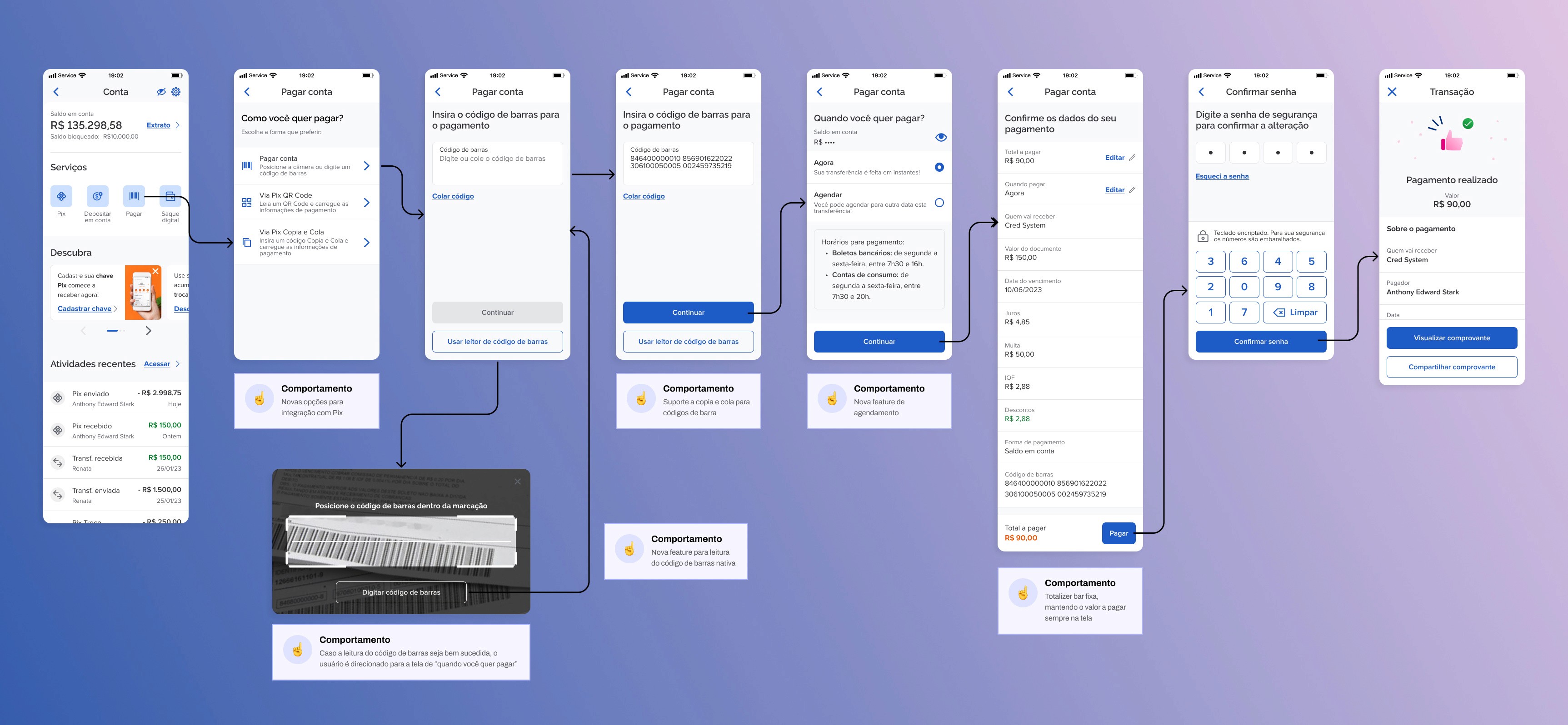
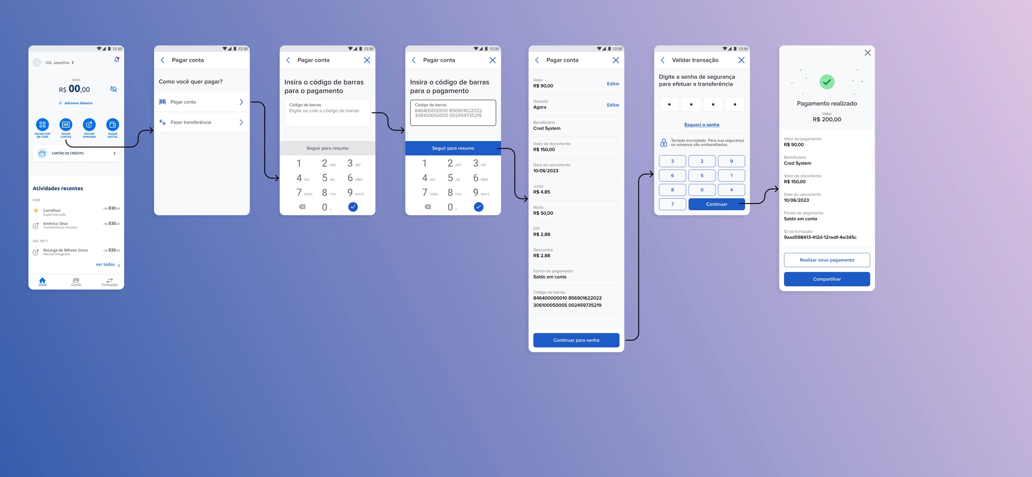
Before and after
Opportunities:
• biometric validation for financial transactions
• customization of home screen shortcuts
• recurring Pix with prior registration of recipients
• visibility control of recent transactions
• inclusion of investment features integrated into the account
These insights helped fuel the product roadmap for future evolutions.
Among the opportunities identified for the future evolution of the product, the following stand out:
Solution redesign - Final version
The final version of the redesign consolidates the learnings from the entire process, translating insights, validations, and product decisions into a simpler, clearer, and more consistent experience for the new digital account. The screens reflect a structured journey designed to reduce friction and facilitate critical tasks, highlighting the integration of the Pix journey, seamlessly incorporated into the daily use of the product.
In addition to usability gains, the solution was built on scalable standards and aligned with the design system guidelines, ensuring consistency in the handoff and efficiency in implementation. The result is a more competitive experience, prepared for future evolutions and aligned with user expectations for digital financial products.
Click on the card to navigate through the screens >

SUS questionnaire results
After the tests, participants completed a System Usability Scale (SUS) questionnaire to measure the platform's usability. The SUS is a widely used tool to evaluate user experience in systems and products.
The template results of the questionnaire were as follows:
Average score: 82.5
A score above 68 indicates an above-average experience in terms of usability. The result of 82.5 demonstrates that the new Digital Account showed high acceptance among the test participants.
Insights:
Get qualitative feedback
Open-ended questions allow users to express their opinions and feelings in more detail, providing insights that would not be captured by closed-ended questions.
Foster creativity
Users can suggest improvements or new features that were not considered by the design team, promoting a more collaborative approach.
Identify unanticipated problems
Participants can mention difficulties or frustrations that were not addressed during the test, helping to identify unexpected problems in the design.
Understand the user's context
Open-ended responses offer insight into the context and motivations of users, allowing designers to better understand their needs and preferences.
Conclusion
The new Digital Account was successfully validated by real users, presenting a high level of usability and good acceptance in critical tasks such as transfers and Pix management.
The experience was perceived as simple, clear, and aligned with the standards established by the market's main fintechs.
For me, this project reinforced the importance of design decisions grounded in research, data, and continuous validation. More than redesigning interfaces, the work contributed to positioning the product more competitively and prepared for future evolutions in the digital financial ecosystem.
Before and after
Opportunities:
• biometric validation for financial transactions
• customization of home screen shortcuts
• recurring Pix with prior registration of recipients
• visibility control of recent transactions
• inclusion of investment features integrated into the account
These insights helped fuel the product roadmap for future evolutions.
Among the opportunities identified for the future evolution of the product, the following stand out:
Solution redesign - Final version
The final version of the redesign consolidates the learnings from the entire process, translating insights, validations, and product decisions into a simpler, clearer, and more consistent experience for the new digital account. The screens reflect a structured journey designed to reduce friction and facilitate critical tasks, highlighting the integration of the Pix journey, seamlessly incorporated into the daily use of the product.
In addition to usability gains, the solution was built on scalable standards and aligned with the design system guidelines, ensuring consistency in the handoff and efficiency in implementation. The result is a more competitive experience, prepared for future evolutions and aligned with user expectations for digital financial products.
Click on the card to navigate through the screens >